On the modern web, images are the single largest contributor to page bloat. An unoptimized image is a lead weight that drags down your site's performance, and it is the #1 culprit behind poor Largest Contentful Paint (LCP) scores.
As we detailed in our Ultimate Guide to Core Web Vitals, a slow LCP is a direct signal of a poor user experience. More than that, it's a sign of a slow, unhealthy server that can cause Google to throttle your crawl budget.
This is not a basic guide on "how to compress a JPEG." This is a definitive, conceptual framework for implementing a modern image strategy that balances quality, speed, and responsiveness, ensuring your images enhance—rather than hinder—your SEO.
(Note: Due to CMS rendering limitations, specific code examples have been replaced with descriptive explanations.)
Chapter 1: Beyond Speed: Why Image Optimization is a Core SEO Task
Optimizing images impacts four distinct areas of your site's performance:
- Core Web Vitals: It is the most direct and effective way to improve your LCP score.
- User Experience: Faster-loading images lead to lower bounce rates and higher engagement.
- Google Image Search: Properly optimized images can rank in Google Image Search, opening a new, high-intent traffic channel.
- Crawl Health: Lighter pages mean faster server response times, signaling to Googlebot that your site is healthy and can handle a faster crawl rate.
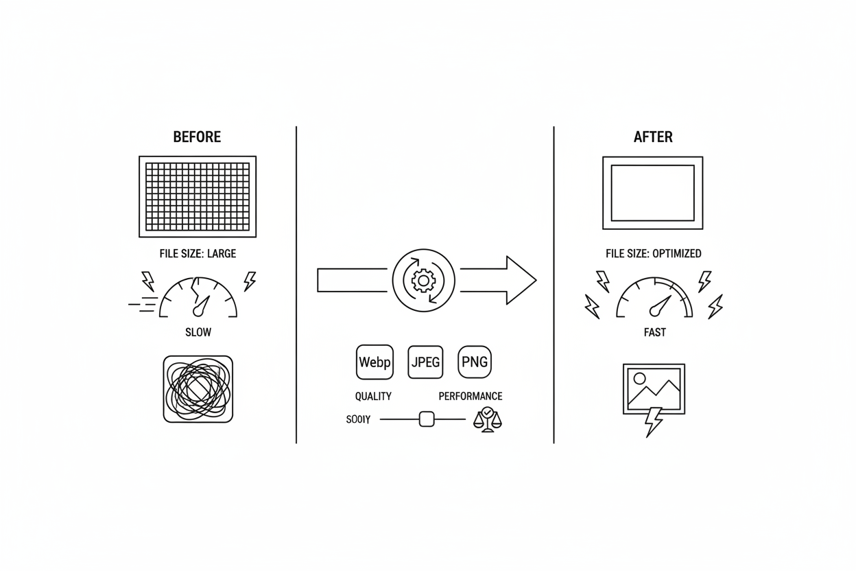
Chapter 2: The 3 Pillars of a Modern Image Strategy
A truly optimized image is achieved through a three-step process: Format, Compression, and Delivery.
Pillar 1: Format (Choosing the Right File Type)
Using an outdated format is like shipping cargo in a wooden crate when a lightweight container exists.
- JPEG: Good for complex photos. Does not support transparency.
- PNG: Use only for images requiring a transparent background (like logos). Never use for photos—the file sizes are massive.
- SVG (Vector): The best choice for logos, icons, and simple graphics. It's infinitely scalable and typically has a tiny file size.
- WebP (The Modern Standard): This is the format you should be using. As Google's own developers state, WebP provides superior lossless and lossy compression. It produces file sizes 25-35% smaller than JPEG at the same quality and also supports transparency.
- AVIF (The Next Generation): Even newer than WebP, offering even greater compression. Browser support is now excellent in all modern browsers.
Pillar 2: Compression (Finding the "Good Enough" Quality)
- Lossy vs. Lossless: Lossless compression keeps all data. Lossy compression intelligently removes data the human eye likely won't notice, resulting in much smaller files.
- The Rule: You should always use lossy compression. An image at 100% quality often looks identical to one at 80% quality, but the file size difference can be huge.
- Recommended Tools: Online tools like Squoosh (by Google) or TinyPNG/TinyJPG allow you to compress images and convert them to modern formats easily.
Pillar 3: Delivery (The Most Critical Step)
This is the advanced step that most sites get wrong. It's not just what you load, but how you load it.
1. Responsive Images (Using srcset and sizes)
This is the most important technique for mobile performance. Instead of serving the same large desktop image to everyone, you should provide the browser with multiple sizes of the same image. This is done using the srcset attribute within your image tag, which lists the different image file paths along with their actual width (e.g., small.jpg 500w, large.jpg 2000w). You also use the sizes attribute to tell the browser how much space the image will take up on the screen at different viewport sizes (e.g., "on small screens, this image takes up 100% of the width"). The browser then intelligently downloads only the most appropriately sized image for the user's device, preventing mobile users from wasting bandwidth on giant desktop images.
2. Serving Next-Gen Formats (Using the Element)
To serve modern formats like WebP or AVIF while providing a fallback for older browsers (like Internet Explorer), you should use the HTML element. Inside the element, you can specify different elements, each pointing to a different image format (e.g., one for AVIF, one for WebP). You also include a standard tag as the final fallback (e.g., pointing to a JPEG). The browser reads these sources in order and downloads the first format it supports, ensuring optimal format delivery for everyone.
3. Lazy Loading (Deferring Off-Screen Images)
"Lazy loading" tells the browser not to download an image until it's about to scroll into the user's view. This is critical for performance on long pages with many images below the fold. Modern browsers support native lazy loading simply by adding the attribute loading="lazy" to your tag.
HH-Level Expert Warning: NEVER, EVER apply lazy loading (loading="lazy") to your LCP image (your main hero image or the largest element visible when the page first loads). This is a catastrophic mistake. It tells the browser to delay loading the most important element on your page, which will destroy your LCP score. LCP elements must always be loaded eagerly (without the loading="lazy" attribute).
4. Image CDNs (Content Delivery Network)
For any site at scale, serving images from a CDN is essential. A CDN caches your images on servers globally. When a user requests an image, it's served from the geographically closest server, drastically reducing load times (latency) and taking the load off your main web server.
Chapter 4: Image SEO (Alt Text & File Names)
Performance is only half the story. You must also provide context.
- Alt Text (Alternative Text): This text description within your tag is crucial. It serves two purposes:Accessibility: Screen readers announce it to visually impaired users.SEO: It provides context to Google about the image's content.Good alt text describes the image specifically, like "A brown dog catching a red frisbee in a park."Bad alt text is generic or stuffed with keywords, like "dog image 01 dog puppy."
- File Names: Use descriptive, hyphen-separated file names before uploading.Good: brown-dog-frisbee.jpgBad: IMG_9481.jpg
Expert Insight for PSEO (Automation is Key): *"For a PSEO site with 100,000 product pages, manual optimization is impossible. The solution is an automated pipeline.The Problem: A client's PSEO template was ingesting 2MB PNG files from their database for every product.The Fix: We built an automated workflow. On image upload, the server automatically does the following:
- Resizes the original to three widths (e.g., 500px, 1000px, 2000px).
- Converts all three sizes to WebP and AVIF (creating 6 total files).
- Ensures the page's HTML template is built to use the element to serve the correct format and the srcset attribute to serve the correct size based on the user's device.
The Result: We cut page weight by over 70%, and LCP scores for 100,000+ URLs moved from "Poor" to "Good" in the next GSC report."*
Conclusion: Images as a Technical Foundation
Image optimization is not a one-time "run it through a compressor" task. It is a foundational, technical strategy that impacts your site's speed, user experience, accessibility, and crawl health.
By implementing a modern workflow—prioritizing next-gen formats, responsive delivery, and strategic loading—you fix the root cause of poor LCPand build a faster, more efficient site that both users and Google will reward.